 I’m very lucky when I’m in London as I always have the opportunity to stay with my brother who lives in Covent Garden just by Seven Dials. I was helping him start a business and we were working in a co-working space at Hub Westminster in New Zealand House at the bottom of Haymarket just off Trafalgar Square. All in all not too shabby a set up really.
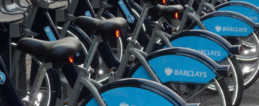
What this meant in commuting terms was that using the Barclays Bike Scheme – or Boris’ Bikes as they are known – was a no-brainer. The number of docking stations around both where I was staying and working was almost overwhelming. Within a 3 or 4 minute walk of the office space were, maybe, 5 or 6 docks. It’s an enormous scheme and dwarves those in other cities.
Using the bikes is not without its ‘issues’ however, and finding a free bike and then finding a free dock to drop it off can be difficult. But, yes, you guessed it – ‘there’s an app for that’.
The application let’s you know what docks are near, how many bikes are there and how many spaces there are if you are looking to drop your bike off. There were some issues around the accuracy of the data at times but, in a very simple way, the app epitomized what ‘mobile’ could and should mean.
Bespoke App Development
Firstly, the app was indeed an actual app designed with an interface all built around a phone-size touch screen. It contained no existing web page content pulled from the website in the form of ‘mobilized’ web pages – it was all new – a mobile app with proper app-designed content and proper interactivity.
Pertinent Information
The app is about giving me information on where to find a bike or where to drop one off. That’s all really. Whilst there is the opportunity to read about the scheme and even sign up this is almost peripheral to the core functionality – front and centre is the information that I need at that moment – where to get a bike or where to drop one off.
Presentation
As well as a map showing the location of the docks the app also had a ‘list mode’. This simply means that I can hold the phone in front of me and an arrow points me in a direction – 140M that way is a dock with some bikes. Simple and straightforward. It’s like when you ask someone for directions in the street – “go down there and turn left..” – sometimes we are not interested in a map – we just like to be told which way to go.
Timely Data
Of course it’s key to this application that the data is dynamic – that it’s right up to date. It’s all about the what, the where and crucially the NOW. It was this aspect of the application that suffered at times but the intention was there and when it worked it was perfect.


In Summary
All seems pretty straightforward doesn’t it? But there are some great lessons here.
When thinking and designing for mobile we must ask ourselves:
What do you think the users might ACTUALLY want to do with this app? Where will they be when they use it?, what help do they need at that point? and what will they want to know?
What will they not be interested in?
How will they like to be told? How should the ‘answer’ be presented?
How can we keep it simple and uncluttered?
How will they want to interact with the application?
Asking some simple questions and focusing on the time and the CONTEXT of use has the power to enable really useful mobile development.
Simply thinking mobile is about re-purposing existing content and collateral doesn’t and won’t cut it.