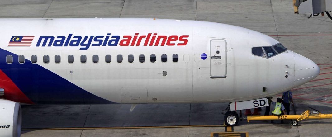
Malaysia’s flag carrier unveiled the new logo rather quietly at a media conference on March 8 when it showcased the livery for its new A380-800 aircraft, which will come into service on July 1 on the Kuala Lumpur-London route.
We suspect the airline didn’t want too much attention because the obvious question will be asked, why spend millions of ringgit on a new logo at a time when the airline is bleeding losses and really, what difference will a new logo make to its fortunes at such a challenging time?
Anyway, if you haven’t noticed the difference, here they are. Gone’s the familiar striking, red and blue that has represented the country and airline since 1987 – replacing it is an all-blue in three tones.

The symbolic wau bukan (traditional Malaysian kite) now flies east as opposed to west. You may wonder at the change in direction, but some suggest this could be good “feng shui”. And the airline will need lots of that to guide it back to profitability.
The old logo, created by Johan Design Associates, was launched on October 15, 1987. It was also then the company changed its name to “Malaysia Airlines” to strengthen the image of its home country, having previously been marketed as Malaysian Airline System.
The media conference was about the only publicity for the “rebranding”, and most reports of the event were on the livery change and not on the logo. However, Malaysia’s active bloggers got wind of the change and many expressed surprise as they were unaware their national carrier has turned blue.
Most of the netizens discussing this change have expressed bewilderment over what they felt was the “cloak and dagger” nature of the move, and questioned the necessity for MAS to change its logo.
.gif)
.gif)
Many, like this writer, also lamented on the change of the colourful old logo to a dull blue design. It feels gloomy somehow.
“If only there were touches of red to give it life and vibrancy,” added a friend when I showed her the new logo and asked for her view.
The reality though is the airline has to do something – it suffered a loss of RM2.5 billion (US$ 780 million) for its financial year 2011, its biggest ever loss in history.
The logo change came just a few days after the report of the massive financial loss and that’s probably why it is played down.
It (change) is part of MAS’ turnaround plan to work its way back to profitability with a new look and feel for its A380 flagship product. This super big bird, with a passenger capacity of almost 500 passengers, will fly the lucrative Kuala Lumpur-London route.
But wait, the red and white logo has not completely disappeared as yet. According to the MAS official at the A380 launch last month, the colour scheme and livery (red and blue) of its existing aircraft would remain unchanged for now although its website is sporting the new look.
So for now, it means MAS is sporting two logos? Which do you prefer? The old or new one?
• Video: MAS’ new A380 in Hamburg going through the first phase of painting to prepare for the new livery.